Spigit Innovation
Redesigning the mobile experience of the leading innovation management software.
A Bird's Eye View
Summary
Around June 2016 I had the opportunity to re-design Spigit’s mobile offering. I was tasked with this project as the negative rumblings from our customers were growing by the day.
I led the project end-to-end in collaboration with the Director of UX, and our User Researcher. The extended team included a fanastic group of Product Managers, Developers, and Customer Success Managers.
In less than three short months, we had the application in our customers hands with a greatly improved product experience, customer satisfaction, and growing users.
About Spigit
Spigit is the leader of the sofware product space known as Innovation Management, with over six million users across the globe.
Jargon aside, the product empowers companies with the ability to generate valuable ideas from their work-force. This could be as simple as “where should we have our Christmas party?”, to the ultimate success story of Polaris building a successful production vehicle(The Slingshot) from an idea generated on a Spigit challenge.
How this is done: a manager would post a topic called a “challenge”. The challenge would be deployed to employees within the manager's organization for employees to submit “ideas”. As submissions compile, the ideas will undergo ratings to surface the best crowdsourced ideas.
Image credit to polaris.com

The Need
“We need this yesterday”.
The Spigit team’s efforts had primarily been spent on the desktop version of the application, but as technology moves forward more and more users complete tasks with mobile devices. While a mobile version of the Spigit app did exist it was less than usable, and woefully outdated.
The need was to redesign an elegant, well performing mobile experience that was scalable for our users.
It was less than three months to the yearly Spigit conference where the latest of the company’s updates would come to light. Customers were chomping at the bit for a proper mobile offering so we were heads down to get the job done before then.
Project Goals
We wished to set our sights to the moon, but time was limited. Our goals for the project had to be effective and achievable.
Our short-term goals:
• Deliver a delightful redesign of the mobile experience to enhance the UI and navigation.
• Increase the mobile adoption from our users.
• Achieve widespread customer satisfaction.
My Role
My role in the project was to lead end-to-end. I was responsible for working with key stakeholders to disect the current mobile app of its pain points, and design a solution that would meet the needs of our users. Throughout several weeks in this project, I practiced a handful of roles to achieve our goals.
Discovery
I led the discovery process with stakeholders to understand the needs, pain points of our customers, and what success would require.
Information Architecture & Flows
I reworked the information architecture and taks flows for an improved navigation.
Design
I worked on iterating to pixel perfection. I designed the UI, visual design, and component library for long-term success.
Testing
I worked alongside our researcher to test and synthesize feedback of our newly designed mobile offering by way of in-person user testing.
Discovery
Why Mobile
We first had to ask the question, why mobile? We had a well established desktop version, but engagement with the mobile version was low.
Roughly 90% of our users engaged solely in the desktop version of the app.
This didn’t come as a surprise despite Spigit was fantastic candidate for mobile. The end users' primary tasks were simple, fun, and perfectly suited for an on the go experience.
There were increasing customer requests for mobile, and the sentiment was clear - customers wanted a delightful mobile version, and they wanted it now before going to our competitors.
What Seems to be the Problem
What went wrong with the previous offering...
As a design team we tested the app on our own, had some internal stakeholder interviews, and spoke with customers alongside the customer success team to discover some key takeaways.
Performance & Bugginess
The app was slow and cumbersome despite its simplicity. Page loads, touch gestures, and general performance had to improve. Improving the experience doesn’t always involve UI enhancements.
Outdated Styling
The styling was completely out of trend with modern styling and UI patterns. Despite styling being a subjective matter the customer satisfaction, or dis-satisfaction rather is key here.
Non-optimized Navigation
The navigation has unnecessary drill down and could be further optimized to reduce taps.
A visualization of the previous UI =)

Customer Demand
It’s worth mentioning the customer base to understand the scale of companies we were solving problems for.
Some of the key customers driving the push for this inititative:
Roles
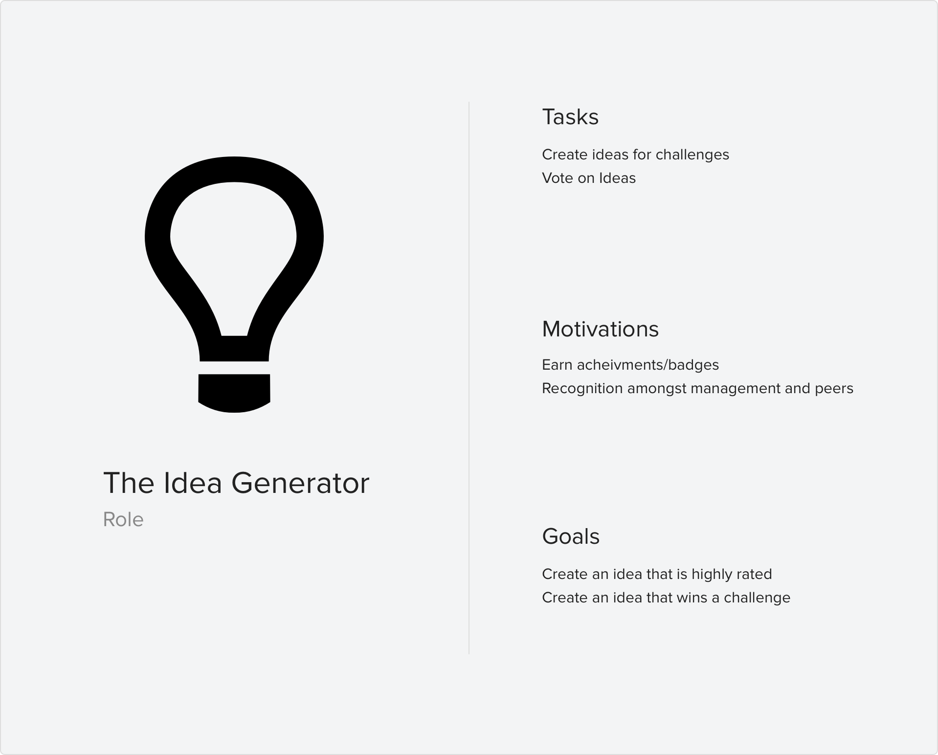
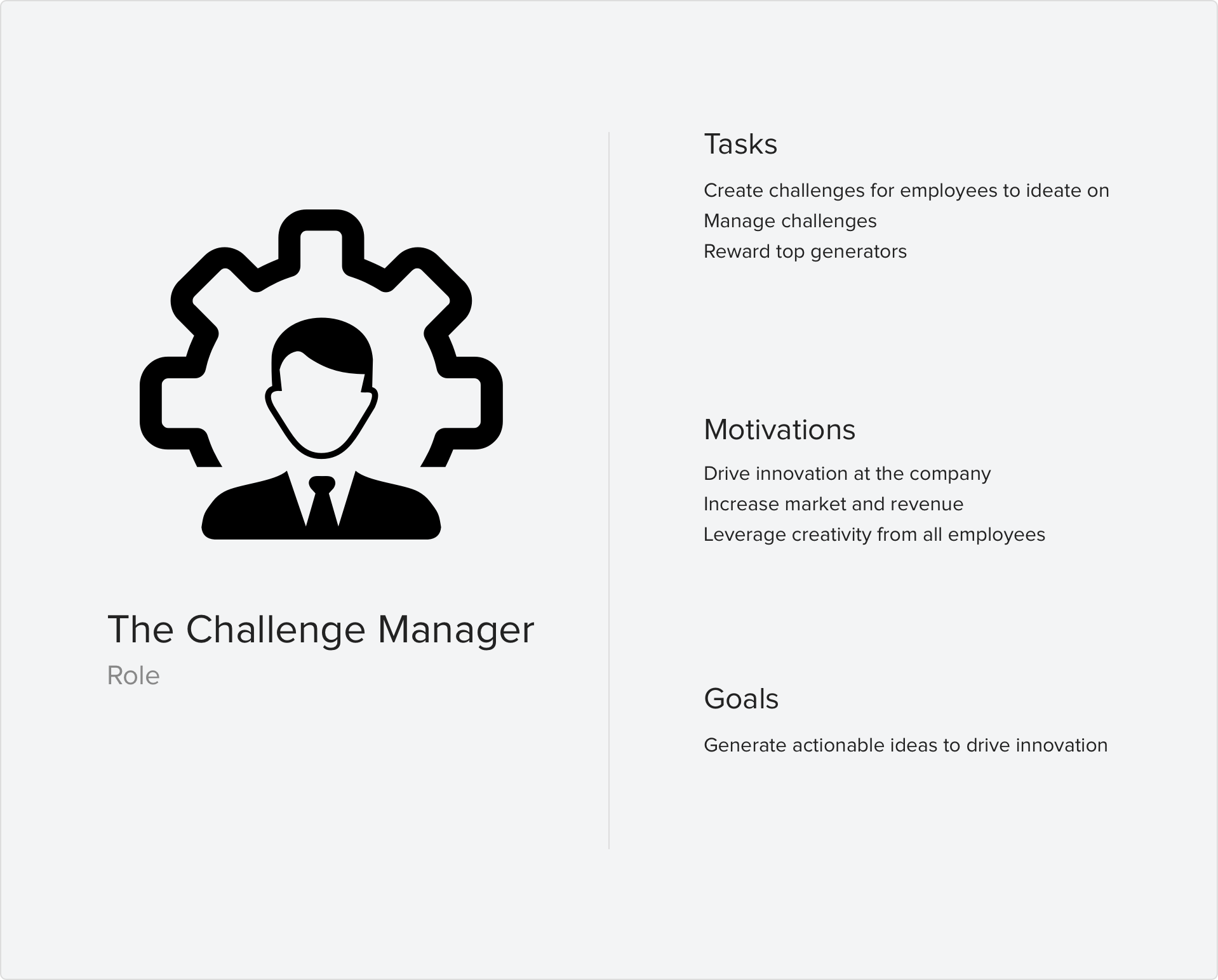
Spigit users fall in to two primary roles: The Idea Generator, and the Challenge Manager.
The Idea Generator’s priority is to view new challenges and submit ideas anytime anywhere. The Challenge Manager’s focuses on checking their live challenges for new ideas generated and top ranked ideas.
Design
Mapping the Architecture
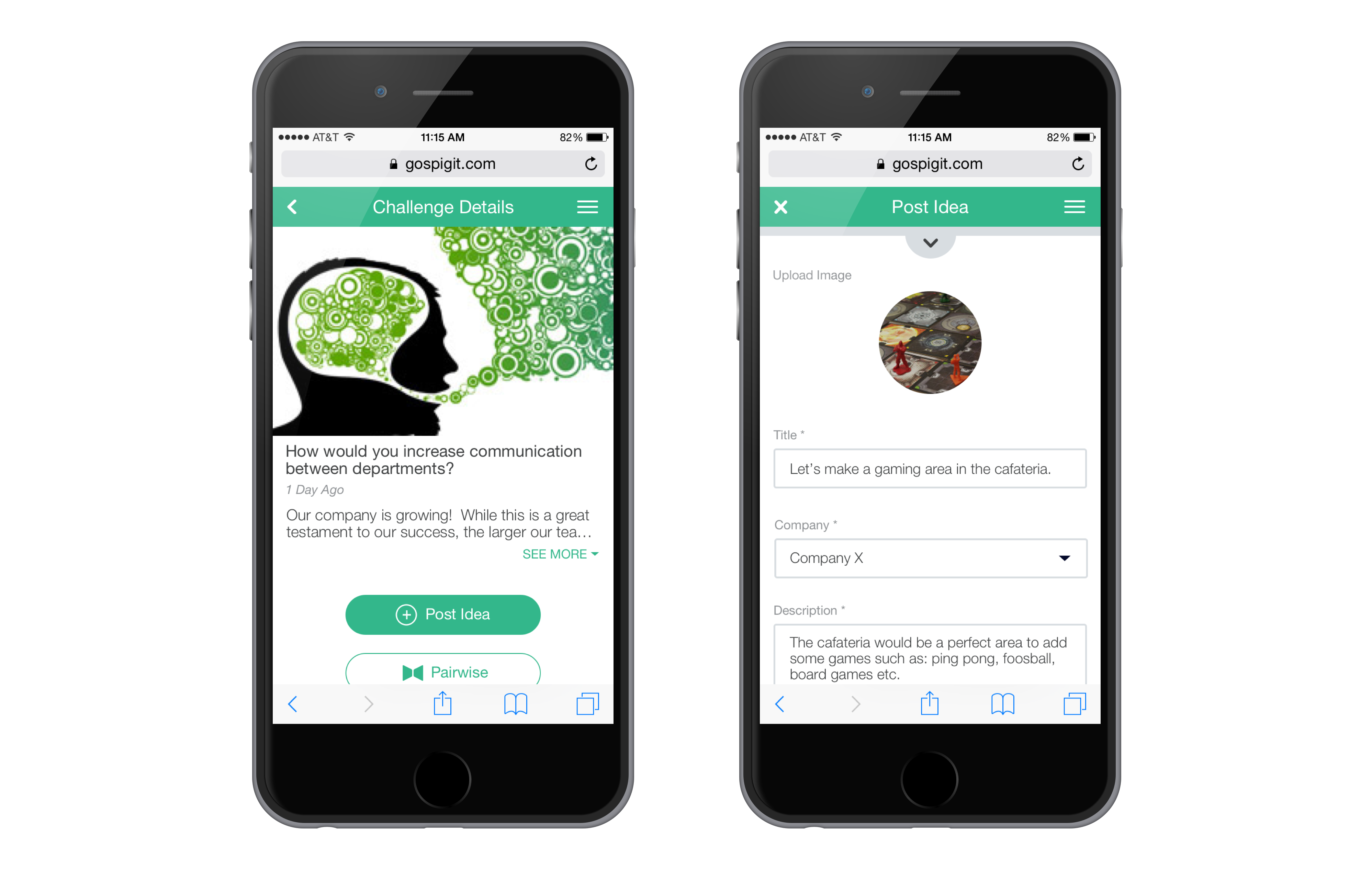
I reimagined the architecture to a more logical mapping. While the featureset is very simple at face value we wanted to highlight the key features and tasks a the top level.
Reducing navigation by a tap or two can make all the difference for a user discovering a challenge and submitting a valuable idea to the platform.
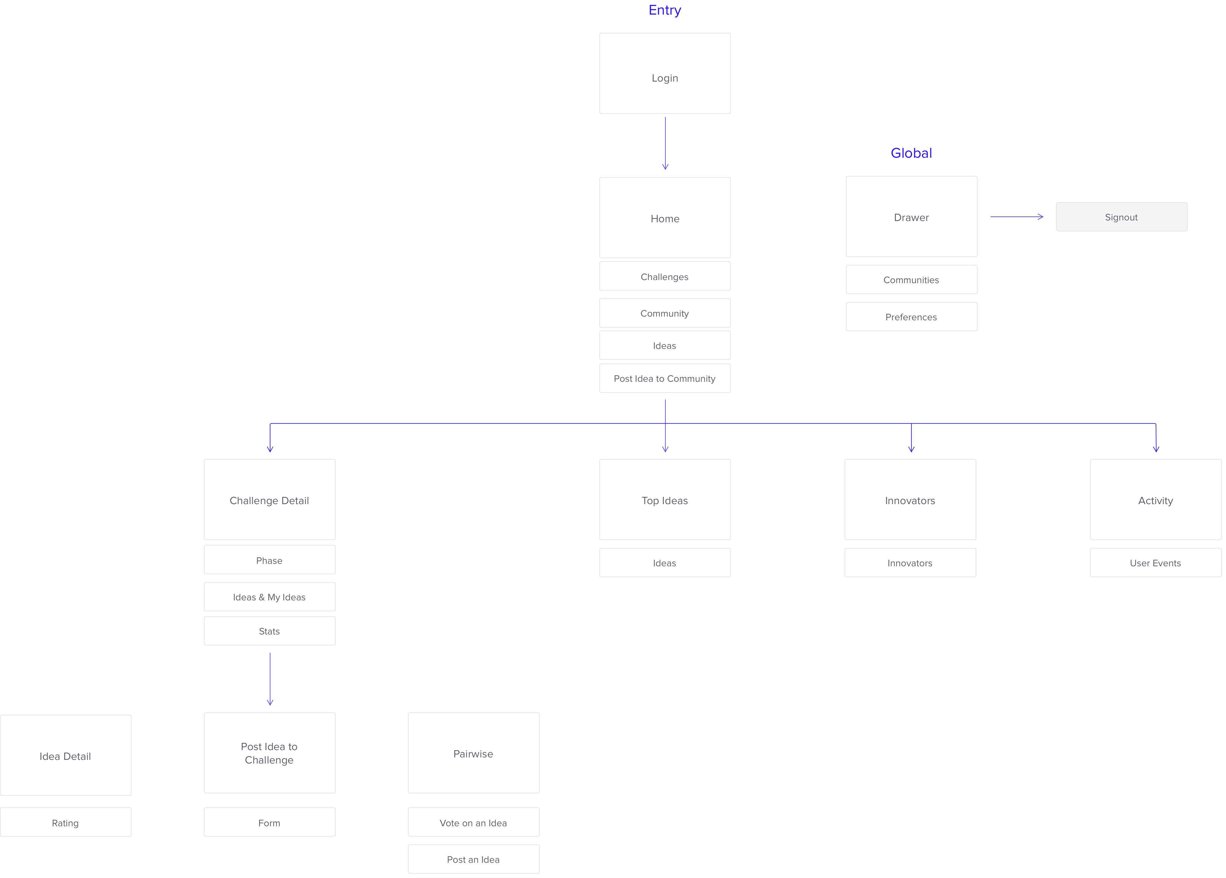
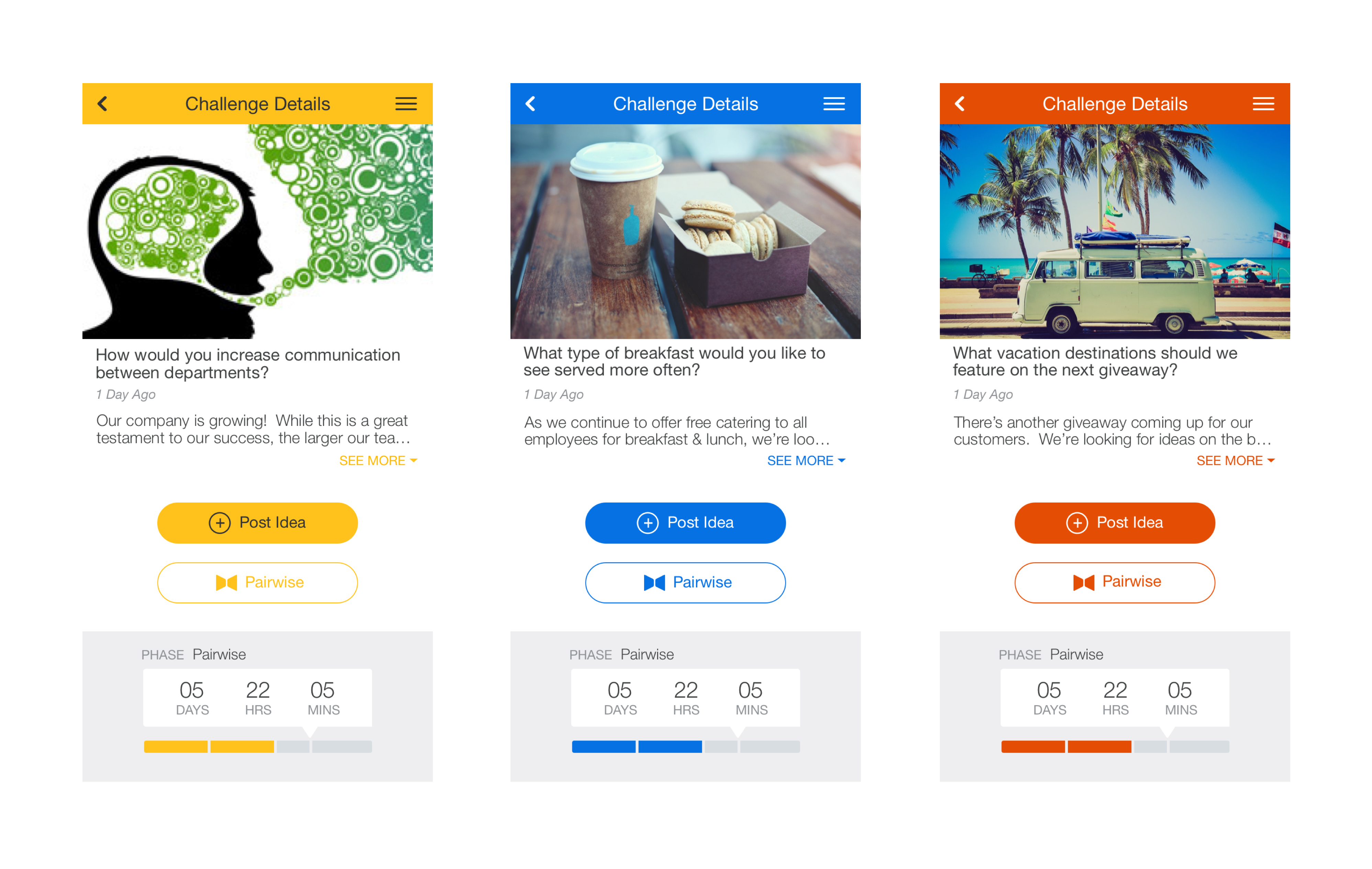
The New Design
The new UI was designed to give the app a completely new look and feel that highlighted the customers' individual branding.
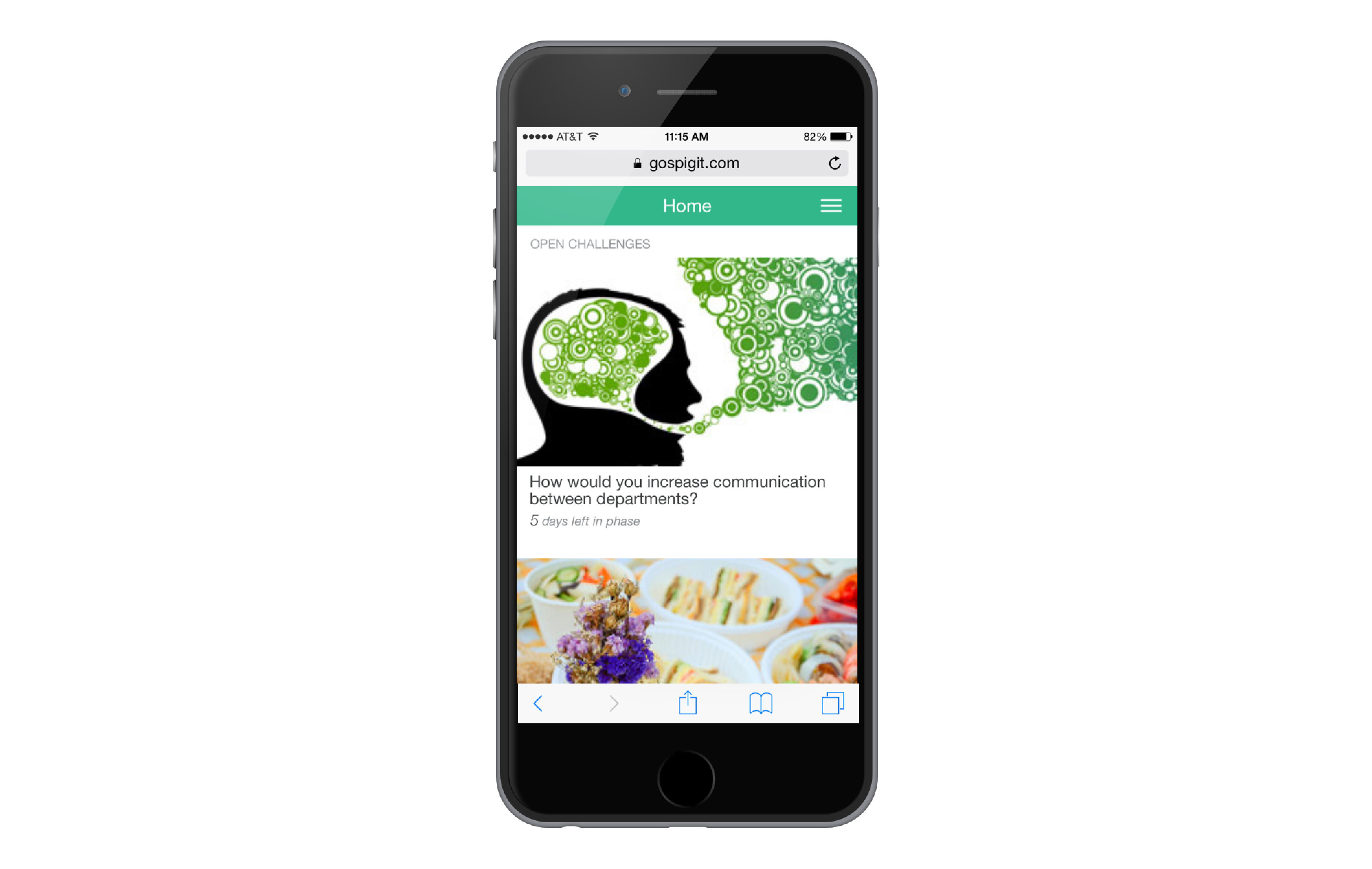
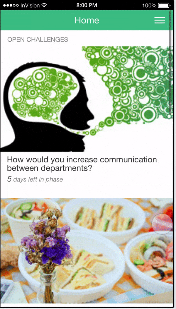
Home
Customizations
Customers have the abiility to customize the interface’s theme to their company’s branding This was an important aspect I strived to highlight in the design.
The customer’s choice of theme color stands as the star of the theme's pallette. When a user lands in the app, I want the user to know they’re in the right place.
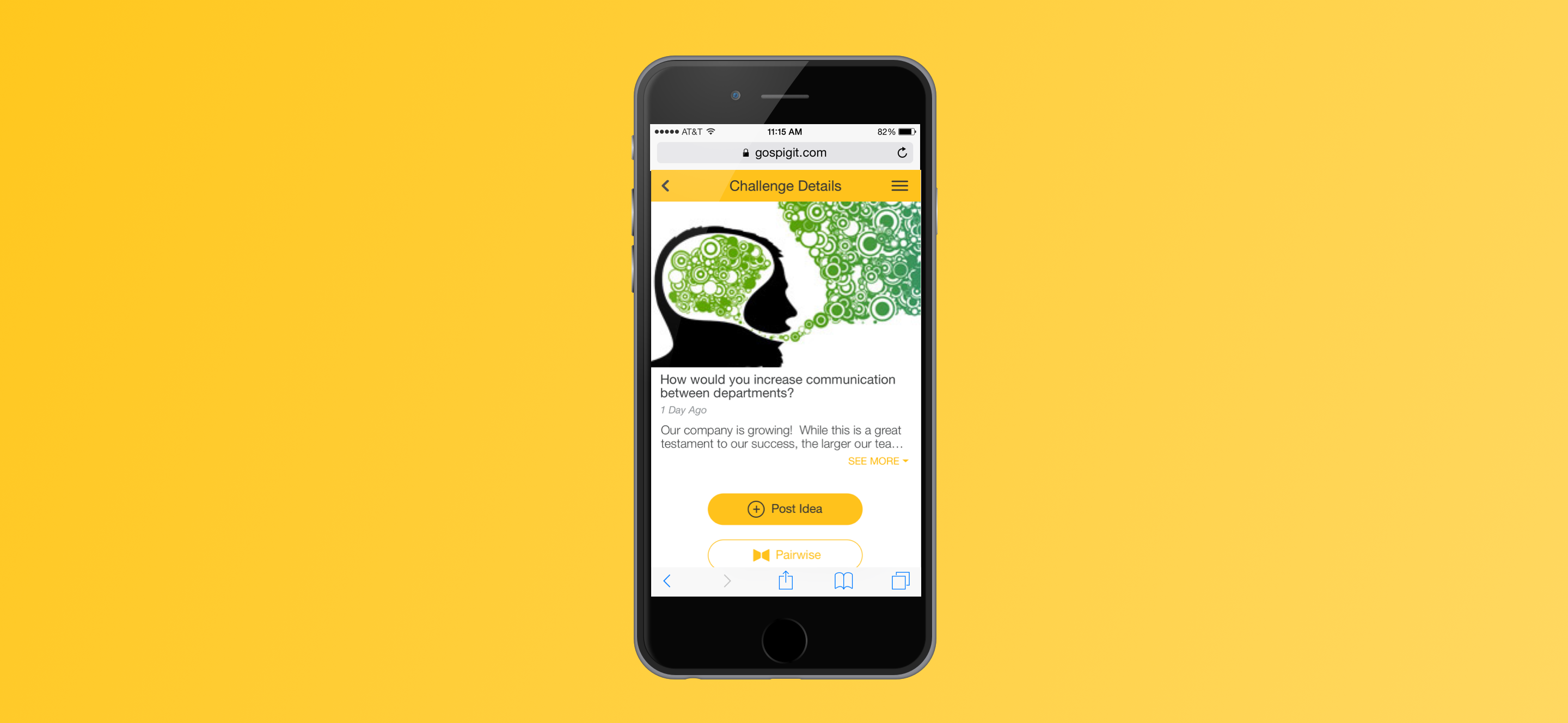
Post an Idea to a Challenge
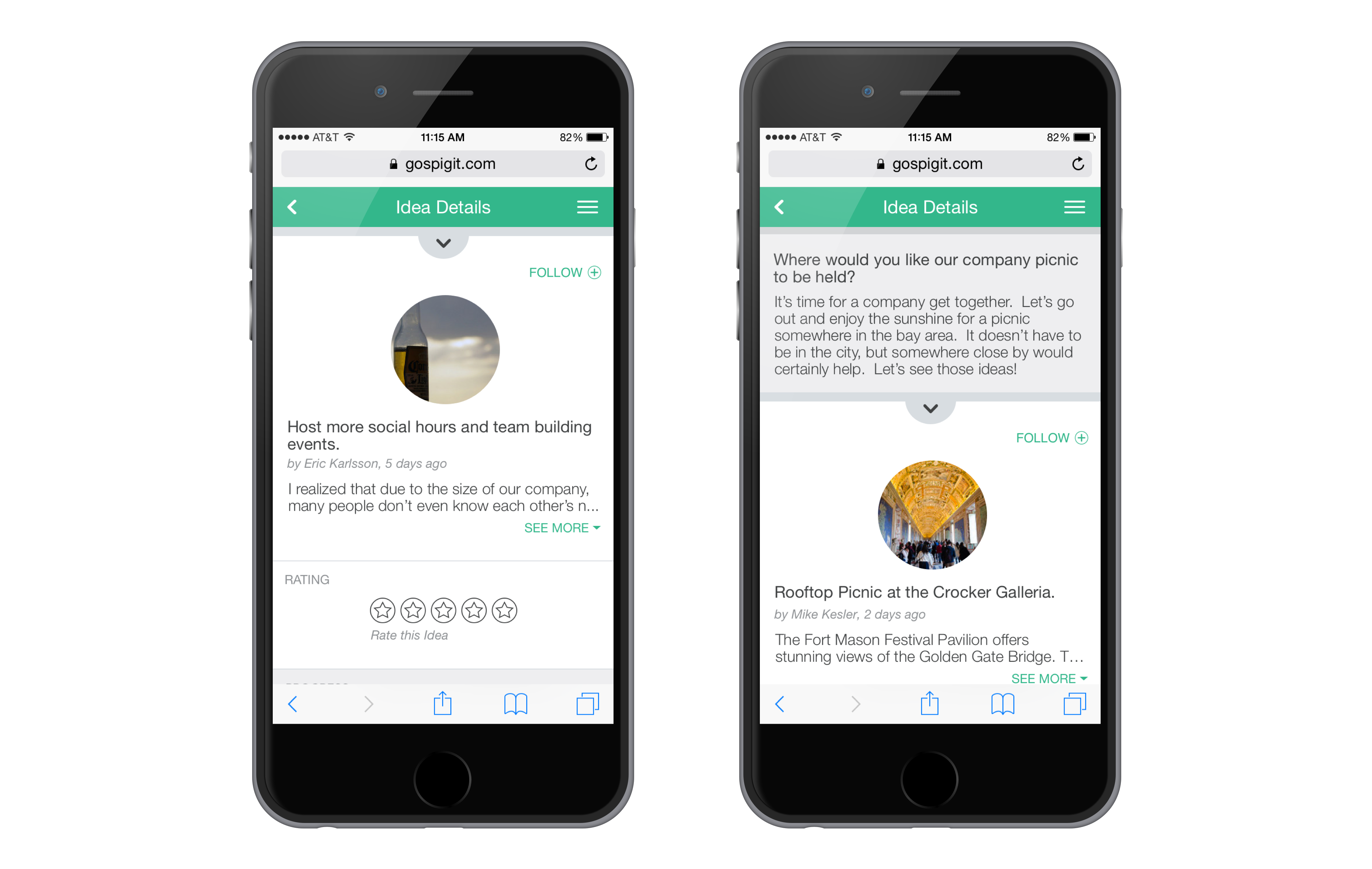
Idea Details
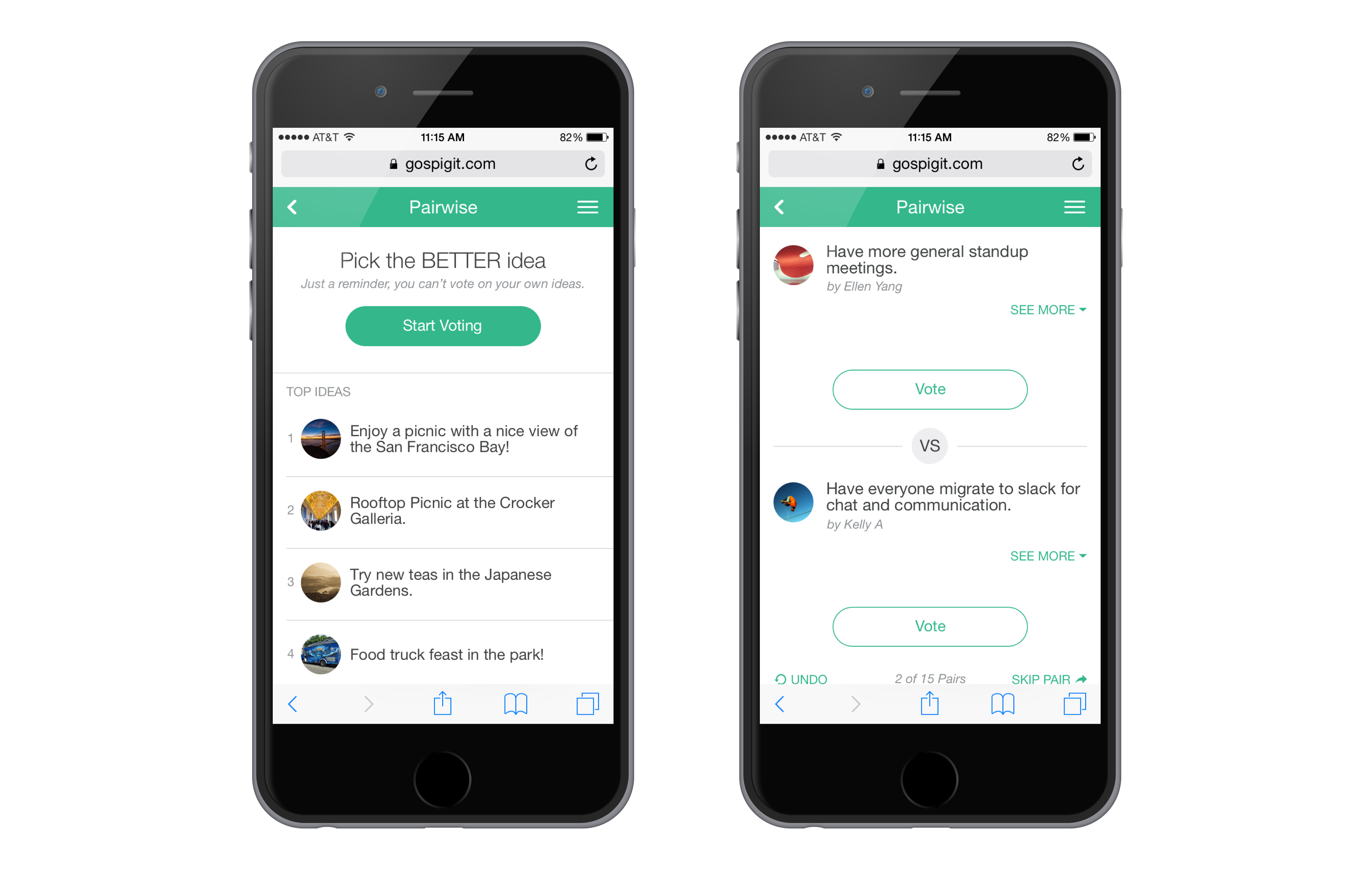
Pairwise
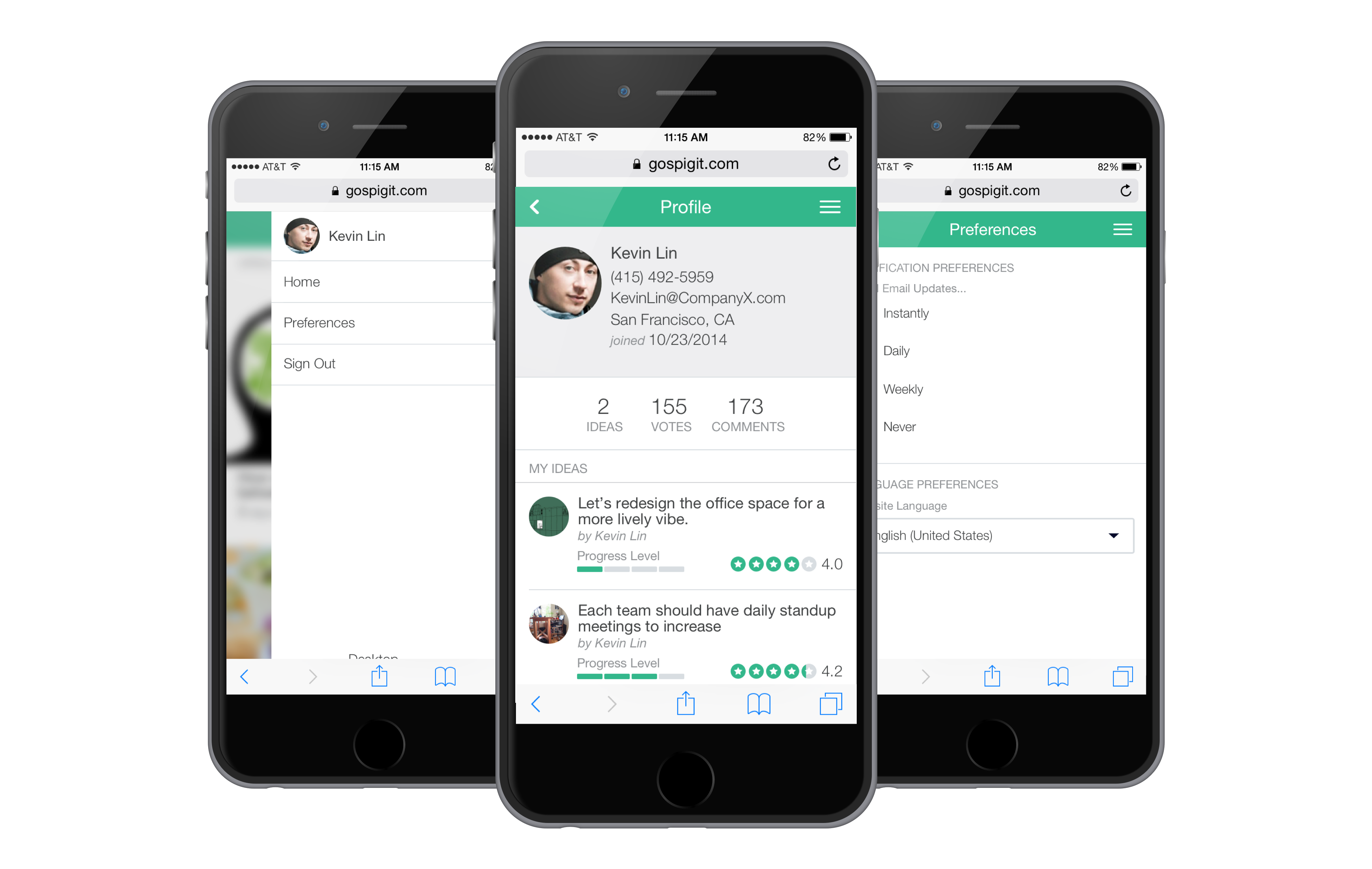
Profile & Preferences
For our Team
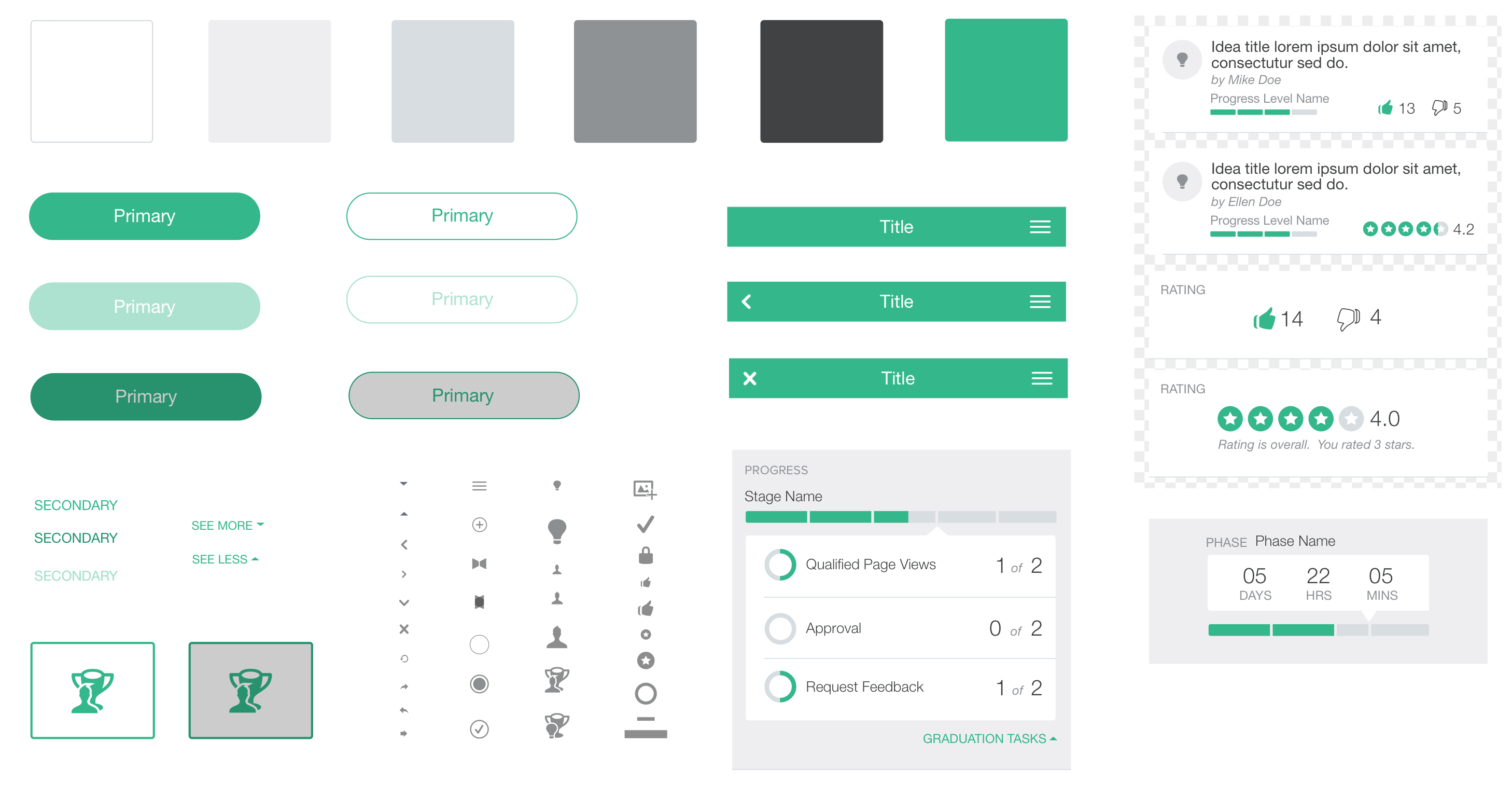
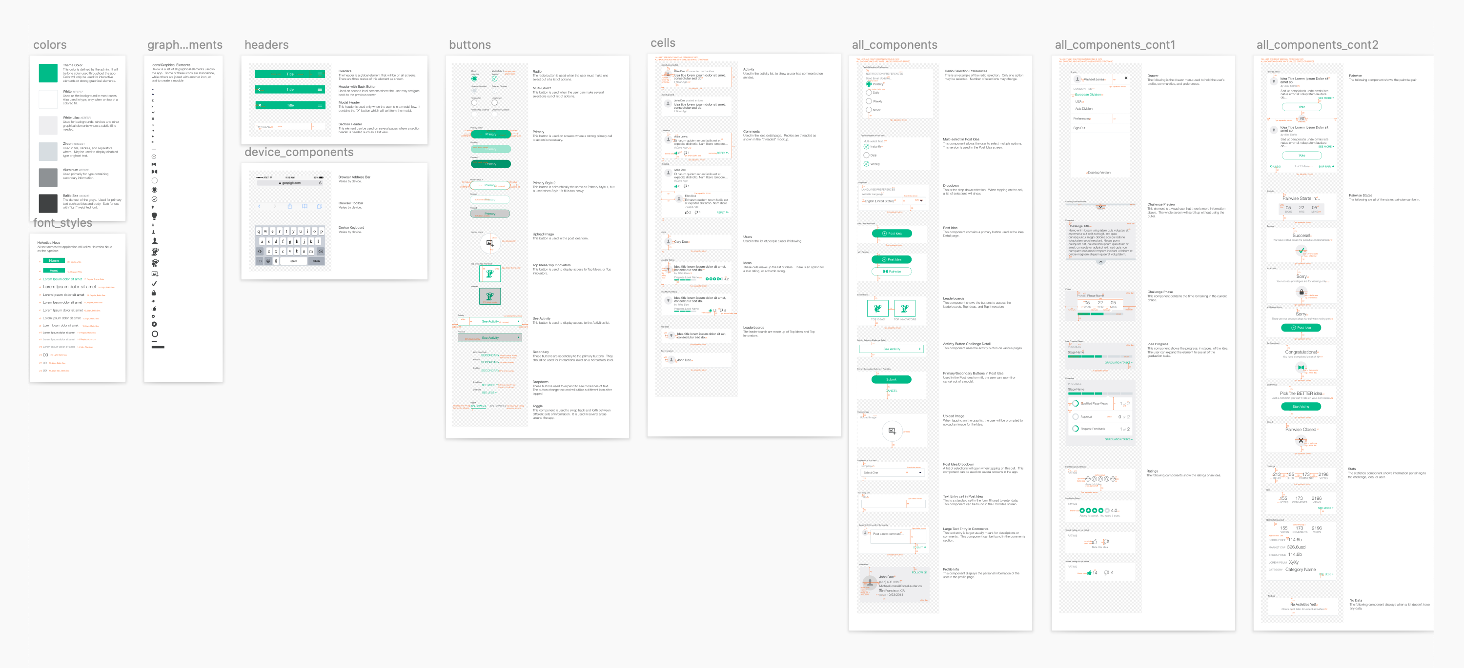
I worked to address the needs of our internal team. The team would require a design system so anyone could easily adopt the patterns for new features.
A component library was assembled with all elements used for this initial phase of the design.
Feedback
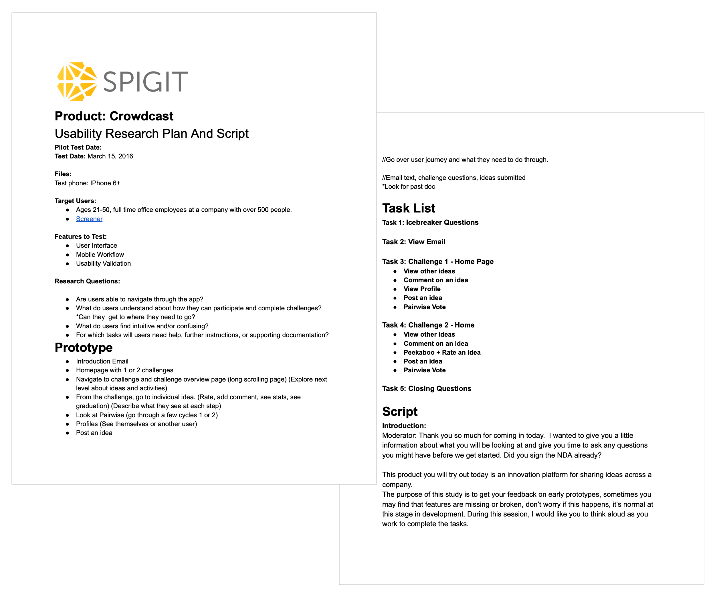
Testing the UI
I paired up with our User Researcher to assemble a testing plan and run usability tests with our users. We had a goal of understanding how successful the new design would be at serving our users.
The sessions were conducted on-site in our usability testing lab. We recruited 9 users (with incentives) coming from companies with 500+ employees and had proficiency with mobile devices. A fully developed version of the app was used to best assess the performance.
Key Tasks
• View Email
• View other ideas
• Comment on an idea
• View Profile
• Post an idea
• Pairwise Vote
A collaboration with Pia Zaragoza
Key Findings
The results were positive:
• Our candidates hit 100% completion rate on all tasks.
• 5 of 6 key tasks were found to be discoverable and learnable based on customer ratings.
• The users found the app to be delightful to use and satisfactory in terms of performance.
There were some challenges found in a few areas of the app including:
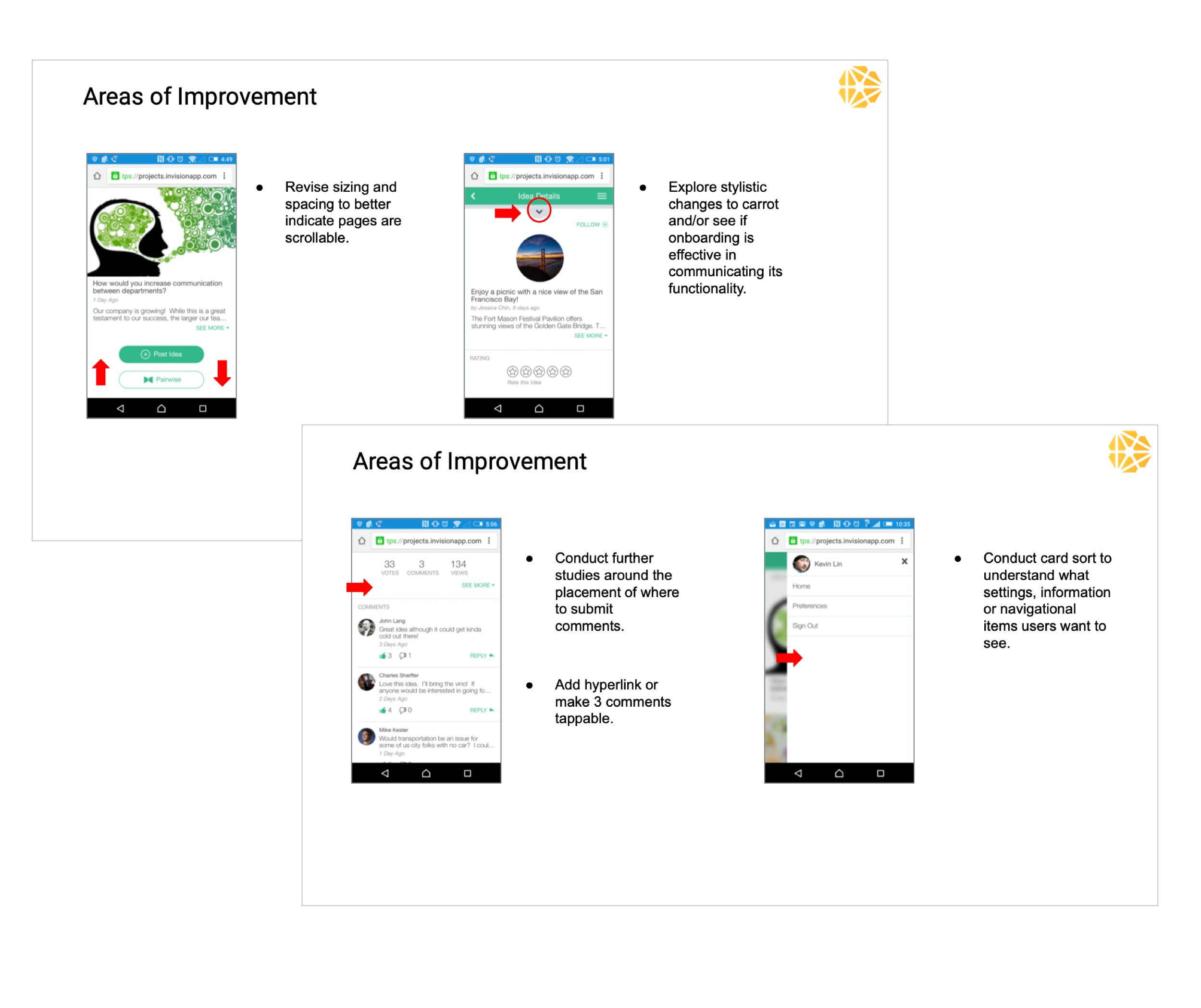
• Some Participants had difficulty comprehending what Pairwise is.
• Some participants did not understand the carrot icon revealing the challenge question.
• Some participants did not discover the content below challenges suggesting an indicator would help.
• Further studies would help around the placement of where to submit comments. Some users did not find them discoverable.
• The lack of settings were confusing to the users, as they may have expected all desktop features to exist on the mobile app
Report snippets by Pia Zaragoza
Customer Feedback
In this scenario, positive customer feedback was one of the key focuses as we aimed to retain customers.
We teamed up with product management and the customer success team to gather feedback. The feedback was overwhelmingly positive. Customers were excited to get their hands on the new version with hopes of increasing engagement from their workforce. After we launched the app, we continued the feedback funnel from a few of the key customers to ensure satisfaction, and aid in future design.
Measuring Success
Measuring Success
If we revisit our goals of delivering a delightful mobile experience, achieving widespread customer satisfaction, and increasing mobile adoption we found the project to be very successful for the short turnaround.
• Successfully avoided churn from key customers.
• Users by device increased for mobile by over 200%
• Customer satisfaction significantly improved.
Future Considerations
The qualitative feedback and immediate increase in users was promising, but there was a lot left to do as there were many features that did not yet exist in the mobile version. I ultimately viewed this as a baseline launch of the app albeit one we can remember for being successful.